 Truth is I was busy on Monday and forgot to update. So Tuesday will have to pretend to be Monday for my sake. Frankly, it's the least Tuesday can do after all I've done for it.
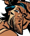
This is the image which you can find on the CafePress Store clock...minus the numbers. It's from a photo that Josh had taken himself (or perhaps a friend took it?) I saw it and just had to draw it. I especially worked at capturing the scruffy little snarl on his face.
 My accident, while Photoshopping, I removed the black layer...and was surprised at how identifiable almost everything was in my under-color! So for fun I'm throwing this up on the wall. You can see just how basic my color is. Nothin' special...I think there are about nine shades and tints here.
Happy Fat Tuesday/Pancake Tuesday! Or just Plain Tuesday if that's how you celebrate it!
best,
j.


9 comments:
Accidents can speak louder than words. But just in case: I love the 'accident' image.
And the original, of course!
Wow! Talk about the same, but totally different. The final art is fantastic! I don't think you've ever posted a full frontal speedo shot of Josh before. This one gives us a better look at all of his attributes. You've been holding out on us Bone! The second graphic has a great sculptural feel to it. As if we're seeing a statue emerge from within the stone that imprisons it. Thanks for posting both. Would it be possible to see the photosource? By the way, the new masthead for the blog is great! The filter you used on "Pin-up Boy!" gives it a newsprint feel. Reminds me of how fun it was to catch up on your favorite comicstrip heroes in the Sunday paper. The larger image of Josh in this pose makes up for losing "No shirt. No shoes. No cervix!"
P.S.: Maybe the byline for the new masthead could be: "Never met a man like this I didn't like."
I asked J to lose the cervix thing because some of the fans are people with cervixes - we like people with cervixes! (J even draws them elsewhere on the interweb I hear...)
Oddly enough my cousin Mitchel took the original photo this is based on (We're kissing-cousins)
Inexplicable Device - Neato, eh? Thanks.
Musclsvg - Thanks, man. I like the description of a sculpture emerging from the stone. Very poetic. Interesting that you see the briefs as a speedo. In the photo our model sported white briefs, which I opted to make even briefer. I sort of drew low-rise pouch undies.
Another request to see the photo source? Are my drawings not enough? Have we perhaps tired of flesh rendered in line and crave, instead, the model himself?
Sorry to disappoint but there'll be no photo of old man Josh. Not yet, at any rate. :)
Josh - Indeed. 'Tis true. I gladly sacrificed my clever pun for the new and colorful banner. You say your cousin took the picture? My word! The life you've led...
best,
j.
Your drawings are more than enough and then some Bone! I ment no disrespect. All stages of the creative process fascinate me. As for Josh's attire: It was skimpy like a speedo, it fit Josh like a speedo and it was red like a speedo. It was also the easiest way to describe it. Now that you mention it, it does look more like a designer banana/nuts hugger. And Josh, kudos on your cousin's Kodak moment.
I'm kinda glad the no cervix is gone. Thanks, guy. Ladies like manmeat, too.
I really love the no black lines. It gives me an idea of how you colour (for example, the red splotch shows you just figured the black would hide any mess, so who needs accuracy). It also does have a beautifully sculptural quality, although from an artistic perspective, it's obviously Cubist. Your strong geometric elements really lend themselves to cubism. Maybe you could try the experiment with some other images?
What can I say that hasn't already been said? Great job.
I think it's good of you NOT to show the photo resource. This blog is about your art. However, I think Josh needs to start his own website as it looks to me that he'd be VERY popular. ;)
Showing the "underpainting" is a great idea, too. Would love to see that more if you care to share.
Just discovered your artwork tonight, and for me...a gay male and a person attracted to comic art featuring hairy chested men, it was like finding the grail! I have looked through about two years of your blog posts, and just have to say that I find your drawings and art of hairy men INCREDIBLY appealing. You have such mastery of the line and expressions you capture on these furry guys is terrific. Thanks for an evening of great artwork...
Post a Comment