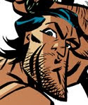

Today, just a quick, fairly loosely inked sketch of Josh. Reference was a photo he took of himself. Oh, how I wish I could show you the photo :) It continues to haunt the baser quadrants of my brain. I went simple, graphic and red with the coloring just to suggest that animal quality. My preference is the half-tone screen, cropped image. It seems eve more feral!
You may (or may not) have noticed that I no longer have a Zazzle store. The Zaz shirts arrived and they were TERRIBLE!! Printing was blurry and the shirt quality was 'meh'. For the higher price I expected much better. So Zazzle is out! CafePress is still in. Every morning I enjoy my coffee in the original, very first, signed and numbered Vargas-Josh coffee mug (large sized, naturally).
Have a grrreat day, my friends!
best,
j.


19 comments:
I'm bummed that Zazzle stinks! :(
But happy Café Press is doing you good. Sadly, I am too poor at the moment to indulge in any of J.Bone goodness. (...now where is my tax refund?)
Your new Josh pic looks as good as ever. That furry man-scape is always a pleasure to behold. That goofy grin is devious and makes me think of the theme song to "True Blood" (BTW- I heart True Blood forever). In case you have no idea what I'm talking about the refrain says, "I wanna do bad things to you!" ;)
Simple and graphic coloring seems to work for me. I wonder how the incredible Michael Wiggam would color your inks? Hmmmmm...
Have you looked at Spreadshirt? I think their quality is above either CafePress or Zazzle.
I saw this pic. Amazing likeness! Especially that sneer-y, sexy smile!!
Andy - Funny you should ask, because Mr. Wiggam has already colored this image. I'm saving his take for another Wiggam post down the road. He did a terrific job!
I'm not familiar with "True Blood" but certainly dig the sentiment. I'm afraid I sent Josh a rather vulgar e-mail after I saw his picture ;)
Cully - Thanks for the tip. I'll check them out.
C. Edwards - It was the sneery smile that I definitely wanted to capture, and amplify if I could. You can attest that my crop is the same. The cropping off of the rest of his face was what I found even sexier about the photo.
*sigh*...if only Josh were real...
j.
Always great to see new art of your male muscle muse, Josh. While both shots have their pluses, I'd have to go with the wider frame. Red is my favorite color and it gives you more of Josh's sculpted form. His chest hair and trail are very wild and you can see how far south his feral goes. Imagining what lies just below the bottom of the frame is going to haunt the baser quadrants of my brain. His hot cum gutters don't help either. Damn you Bone! You cruel maniacal toon maker!!
P.S.: To echo C. Edwards remark. Whadda ya mean, "If only..."?
Musclsvg - I like that term "Male Muscle Muse". Me? A maniacal manufacturer of muscular, male masturbatory markings. Men are my muse!
Now really, a guy as amazing as 'Josh' just can't be real. Can he?
:)
j. 'planting seeds of mystery' bone
This last drawing is way too hot! You're gonna make everybody fantasize about Josh now!
Fantastic images, as always. I like them both in different ways. The half-tone screen has the feel of a newspaper comic from when I was a kid and makes me feel kind of nostalgic. The full-color is just plain hot seeing the abs and the trail.
The wicked smirk is great...makes you wonder what he's getting ready to do.
Xavier - That sounds like a lovely way to spend an afternoon :)
Jeff - The sense of nostalgia is why I always like that half-tone screen. It sort of blurs the edges. Computer coloring can be so slick sometimes I like to 'old-timey' up the art every now and then.
best,
j.
I'd love to see the original. Grrrrreat drawing!
Is the original who I think he is? You're right, he should try to taint his hair :D
Writer - Thanks!
Xavier - I'm not sure who you think it is...nor what it means to "taint" hair :). Methinks you'll have to elaborate.
j.
Sorry, wanted to say "dye his hair black". Is Josh RJ Danvers? :D
Oh, had the answer on the "other side": he is not. Now I'm wondering how hot a drawing of Josh and RJ barechest by you would look!
Xavier - No problem, Xavier. I did the same back and forth. Checking RJ's blog your comment became clear :)
As to how hot that drawing would be? I would think it'd be pretty hot...but that's just me. ;)
best,
j.
This is a stunning piece! I love the half-tones one! I think any of these would make an amazing and sexy wallpaper.
thet's super hot!!
I like them both. Yeah, there is something cool about the half-tone effect though.
Glad to know about Zazzle. I've heard of Spreadshirt too, but don't know how they compare to Cafe Press. Why are you looking for another company besides CP?
I met Josh out here in LA at a party a mutual friend who is also a comic-book artist threw! Didn't realize it was the same Josh from you blog until a Toronto friend of mine pointed it out. Small world!
Post a Comment